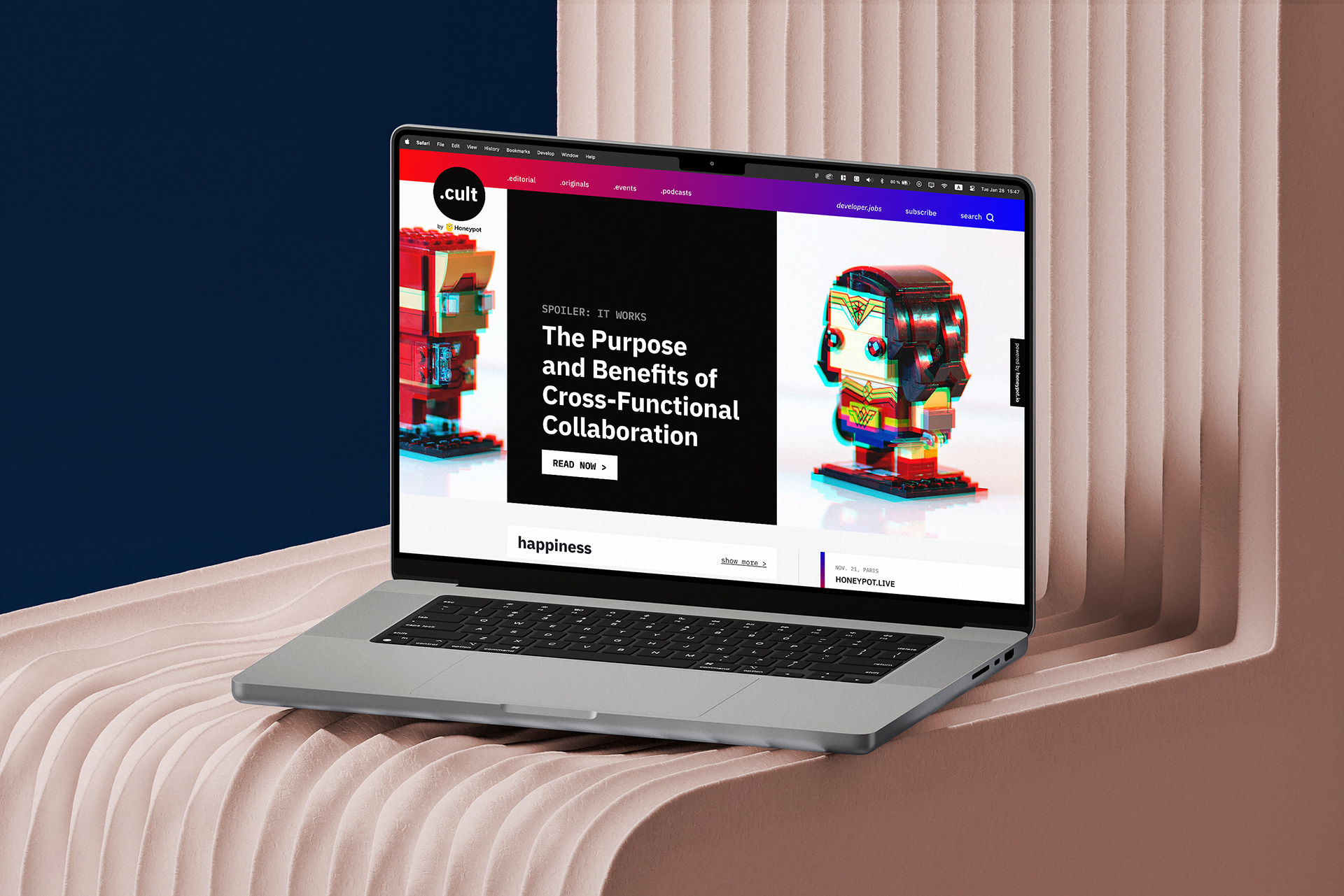
homepage of .cult by honeypot
"untold developer stories"
.cult by honeypot?: a media hub for developers by honeypot. as a community-driven media platform, ‘.cult’ tells untold developer stories and aims to make the users feel at home and belong by being sincere, real, and down-to-earth. .cult differentiates itself from similar platforms by creating excitement through unique, imaginative and daring content for developers focused on topics around careers, leadership and developer culture, across editorial, video, podcasts and events.
objective: create a distinctive, colorful, visual-heavy, memorable and most importantly a 'human' branding for the planned media hub. no hacker vibes. design the platform and work with an external development agency for its implementation.
audience: software developers and technical professionals at any level, people interested in open-source and developer culture.
tools: adobe creative cloud products (various tasks), figma (product tasks)
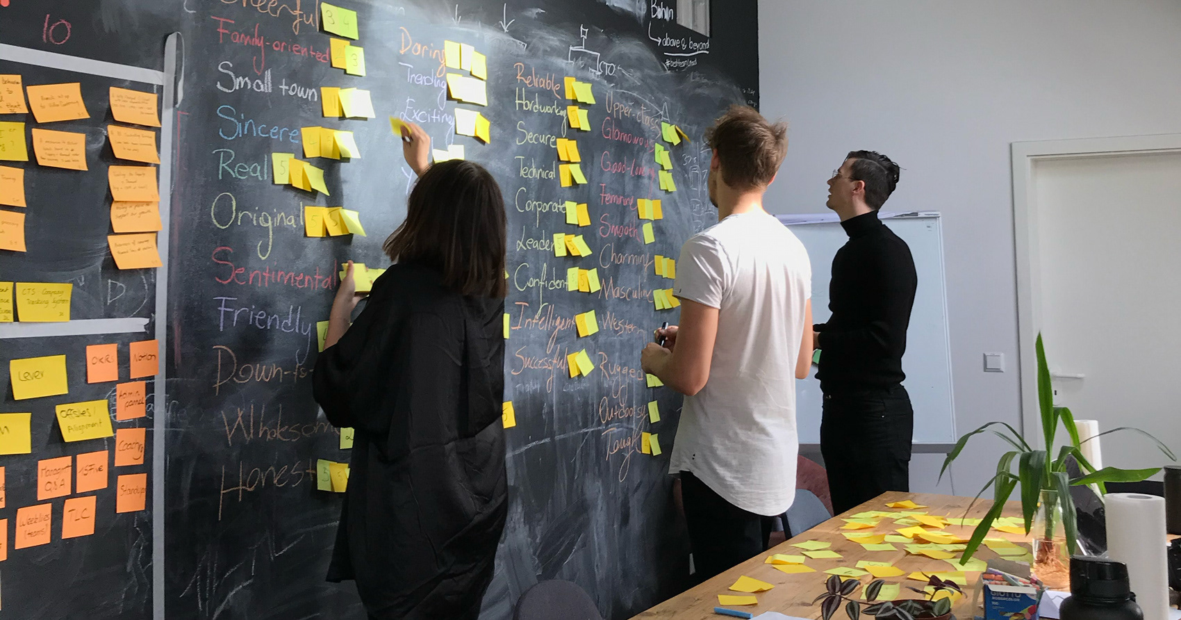
brand direction & personality workshop facilitated by me
.cult by honeypot brand was born in order to be free, free from commercial expectations, free from sales goals, and free from bullsh*t: just like developers. it was created to be a social, storytelling, human brand.
the visual brand of .cult takes these qualities as its foundation and combines them with visual elements inspired by television’s (old) test screen and retro, low resolution arcade/console games.
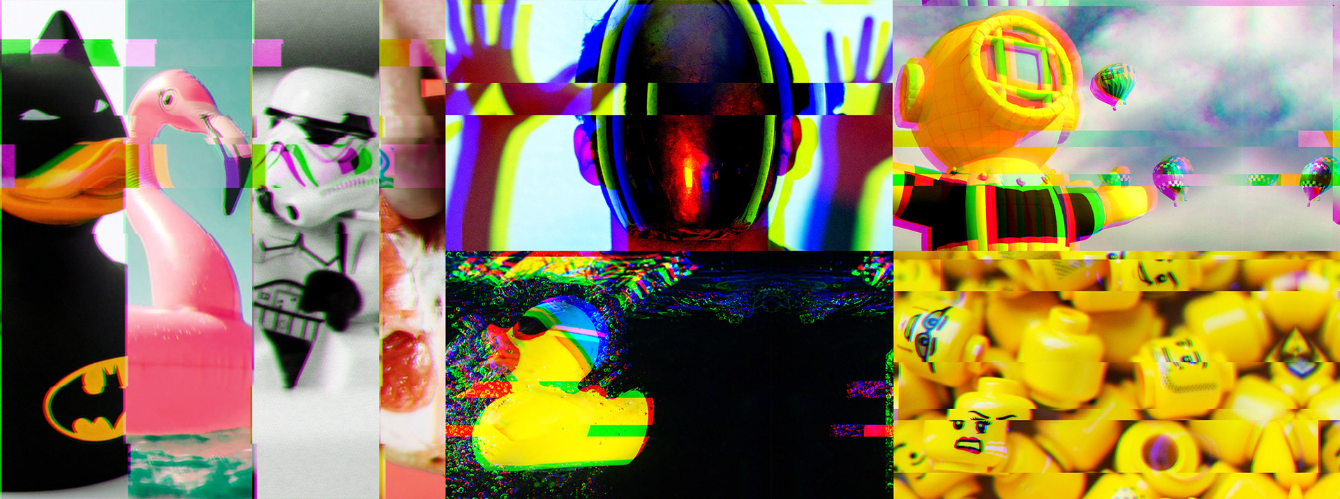
various article visuals with glitch effect applied
glitch, but why?
conceptually, by invoking the idea of a mistake, but one that can only be done digitally, it bridges the gap between the digital and human aspects of the .cult brand.
visually it brings movement, adds even more color to images used and makes them unique.
practically, it allows royalty-free, stock, low-quality and low-resolution images to be used without sacrificing the visual unity, and makes it possible to repeat/crop images on different screen sizes since it turns the ‘mistake’ into an intentional element for .cult’s visual language.
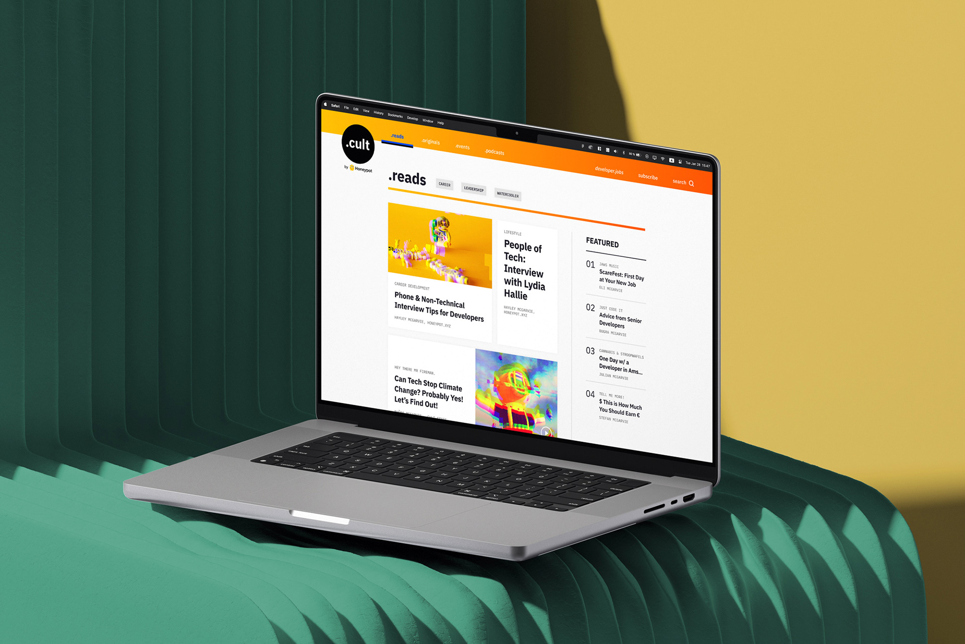
main page of the .reads pillar
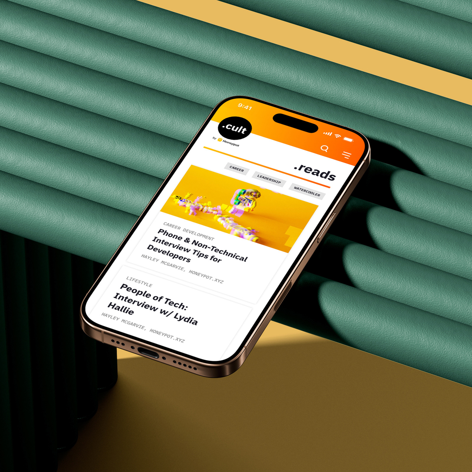
mobile version of the .reads pillar
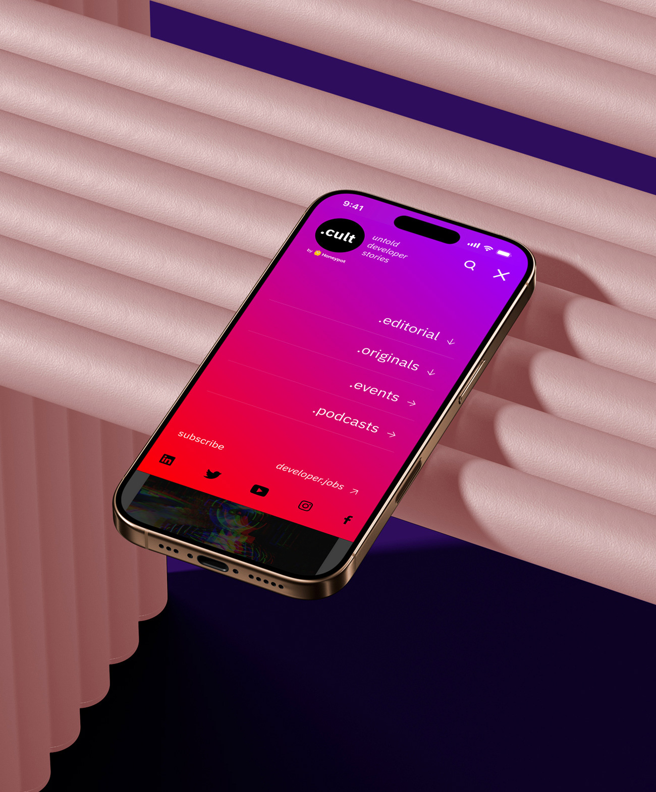
mobile menu
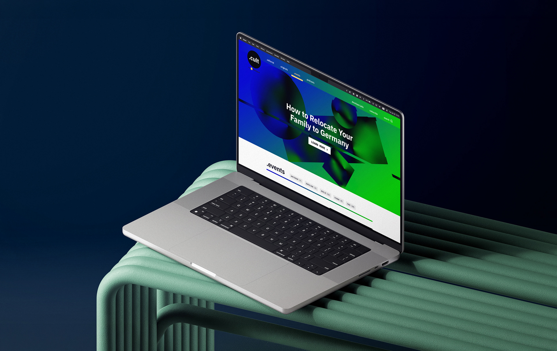
main page of the .events pillar
i conceptualized and collaborated with the developers to create a feature that enables editors to choose a pre-determined .cult gradient to go with each article's visual. this allowed us to reduce visual clutter and create visual cohesion on each page. pages with more than one post used the gradient of the hero/top article.
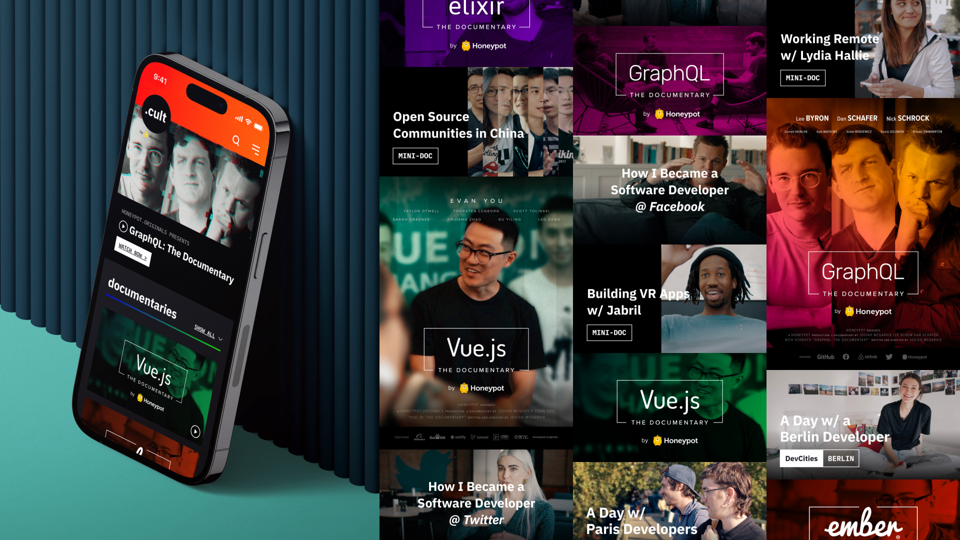
mobile version of the .originals pillar | posters, thumbnails for the video content
honeypot.originals, where the idea of a developer-focused media platform was born as a youtube channel, already had an established visual language that put the hero(es) of its stories into focus. to create a visual bridge with the .cult brand, honeypot.originals' typeface family was updated to align with .cult, and under the .cult platform, hero visuals were treated with the glitch effect.
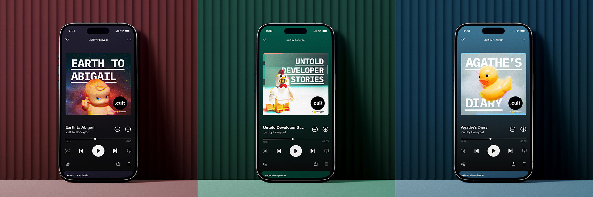
examples of podcast visuals